Campus way-finding app
Role:
UX REsearcher
Duration:
10wks
Jan - apr 2023
Tools:
Figma
FIg jam
ZOom
Google forms
Skills:
UX Research
User interviews
Affinity Mapping
Task analysis
Experience mapping
Streamlining the U-M Journey: UX Research Powering U-M's Campus App
Agenda:
problem discovery
Background
The problem
Research questions
Process
Coding INterview Notes
Affinity Diagram
Survey Design
Data Visualization
Key Takeaways
Research Deliverables
Next Steps
Problem Discovery
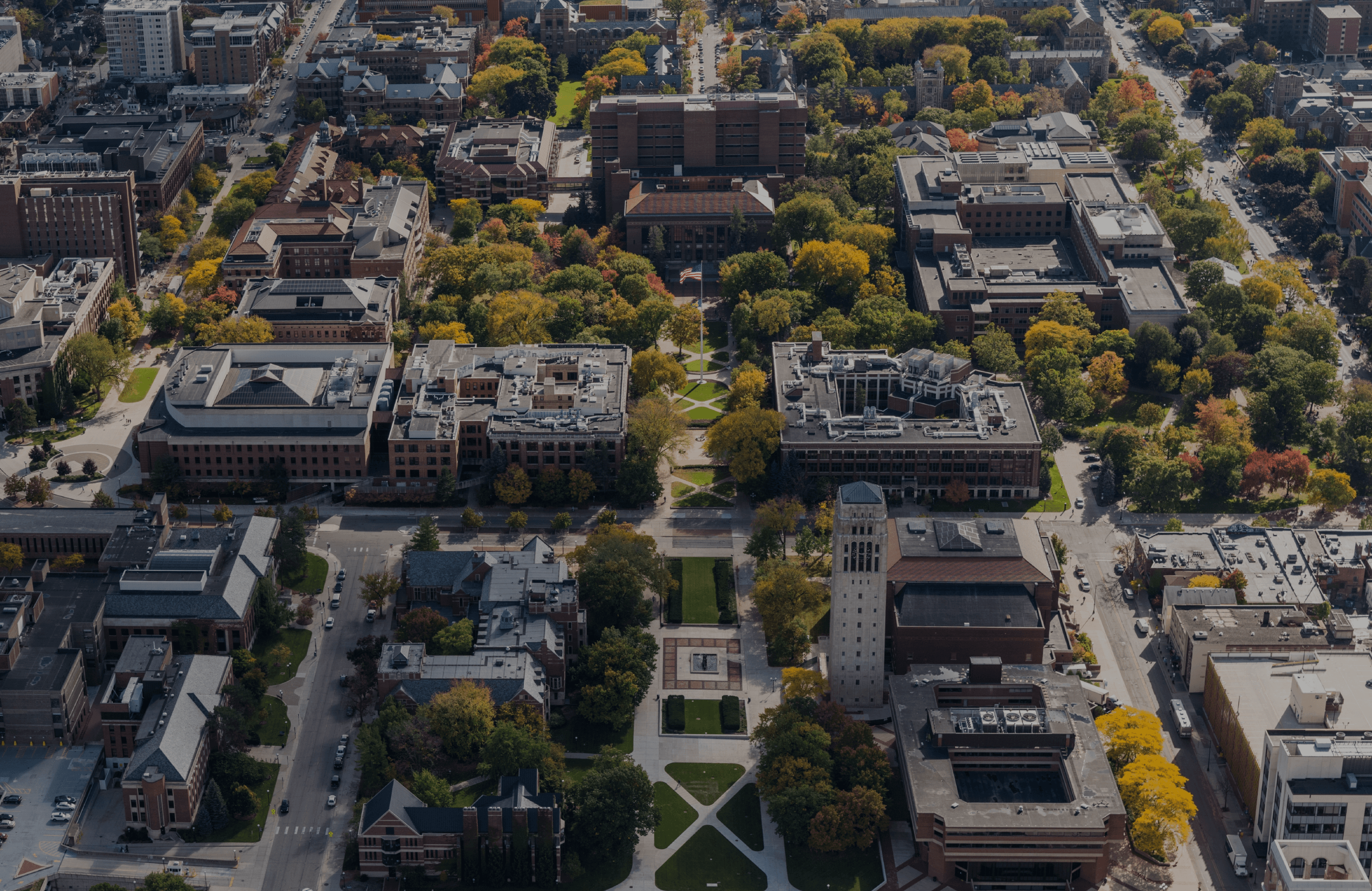
The University of Michigan's Ann Arbor campus encompasses over 3 million square feet across more than 500 major buildings. The expansive grounds and heavy foot traffic of over 50,000 students and staff present navigational challenges. Currently, there is no comprehensive, up-to-date mobile application to assist with way-finding across campus for students, staff, and visitors. This leads to disorientation, difficulty locating buildings and venues, and frustration for campus newcomers.
The University of Michigan needs an intuitive official mobile app dedicated to indoor/outdoor navigation and wayfinding. This app should provide searchable campus maps, building/venue information, navigation features leveraging GPS, accessibility resources, and routing for custom destinations. By centralizing campus navigational resources on an accessible, mobile-friendly platform, the University can better serve student and visitor needs while fostering a seamless on-campus experience. Developing an innovative wayfinding app would enhance the University's technological capabilities while enabling users better learn about and navigate its expansive campus.
Background
The University of Michigan, spanning a massive area of 3,177 acres, 600 buildings, more than 2,000 classrooms, and encompassing a student population of 51,225, it is no wonder that students still utilize Google and Apple maps well into their upperclassmen years. With its massive area, navigating campus can be a challenge for many visitors and even long-time members of the U-M community. In an effort to improve way finding on campus, SI 422 has engaged me and two other researchers in a user experience (UX) research project to better understand the needs of its users and develop a more effective way finding system.
The goal of the project was to design a way finding system that would help visitors, students, faculty, and staff navigate the campus intuitively and find their way to their desired destination. This was a complex challenge, as the campus is home to dozens of buildings, multiple parking structures, and thousands of classrooms. Our team was tasked with identifying pain points and opportunities for improvement in the current way finding system and developing a user-centered solution that would meet the needs of all users.
THE Problem
'UM would like to create a campus way-finding app to help students.'
So what are the biggest challenges that students face in finding what they need on campus?
Our goal is to validate the problem and provide recommendations for a comprehensive campus way-finding app that consolidates information from various existing apps.
Research Questions
What are the initial experiences that users have when navigating the University of Michigan Campus?
How has it changed over time?
How do users familiarize themselves with locations of classes during a semester from the time they first receive their schedules?
How do users identify the buildings from Wolverines Access after registering for classes?
What process do users have for locating/determining a place to go to?
What campus resources do users use like dining halls, libraries, cafes, and similar services and how did they discover them?
Do users have preferences for certain services over others? Why?
How often do users utilize the Michigan Bus System, and what purpose do they specifically use it for?
What are some thoughts that users have about the transportation at U of M? What are some common pain points that users experience?
How do users currently navigate campus and what methods do they use?
Are there any features that users would like to see in a way finding system for the University of Michigan?
What information do users need when when navigating the campus and what information is lacking in existing navigational methods?
To answer these questions, my research team devised a research plan employing a variety of multifaceted research methods, including surveys, user interviews, interview coding, and contextual inquiry. Through this research, we sought to gain an in-depth understanding about the users’ needs, preferences, processes, and pain points to inform the development of a divergent way-finding system with user experience in mind.
PRocess
Our research team started by drafting all assumptions and requirements that we have about the current experience when navigating the University of Michigan campus. Understanding that user interviews would contribute greatly to the overall success of our research,
we first started by brainstorming an audience profile with inclusion and exclusion criteria and identifying all audience profiles to diversify the study.
Add more interview process information about contextual inquiry and the questions asked and why we chose contextual inquiry instead of other deliverables.
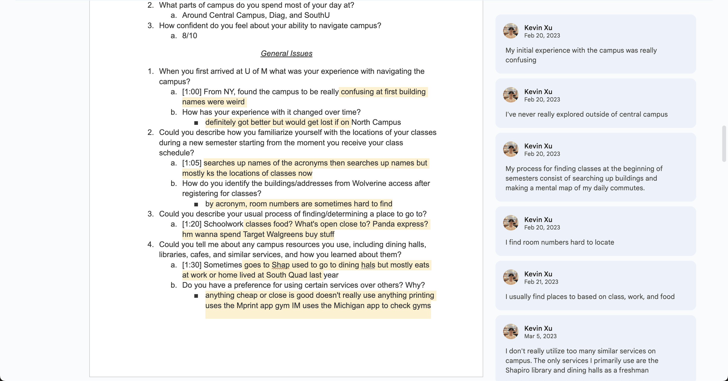
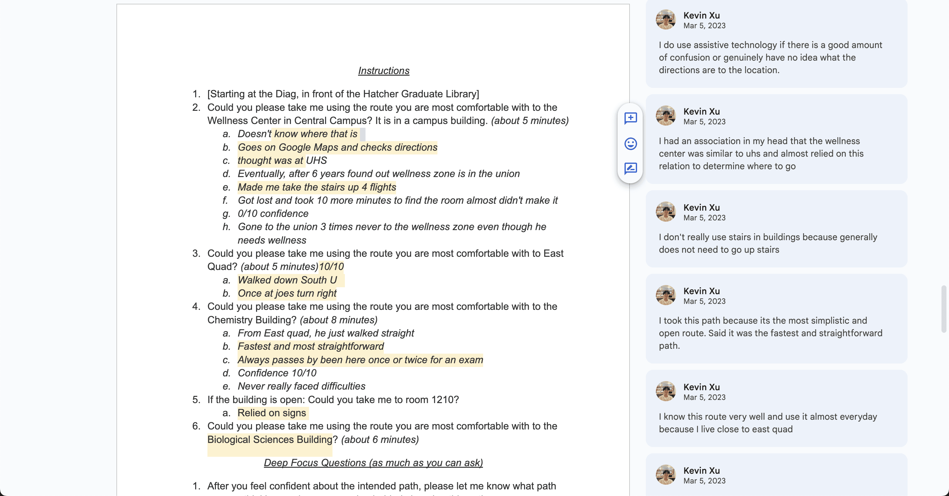
After considering all edge cases, we drafted a participant interview script to conduct a recruitment plan and user interviews with our target audience. The interview included an introduction and an informed consent, interview questions with a warmup section and a general issues section, then a deep focus contextual inquiry activity, and debrief and wrap-up.
We then administered this script in our interviews with users in person around campus. I did a total of 3 interviews one as the facilitator, one as the notetaker, and one facilitating and note-taking.
Coding Interview Notes
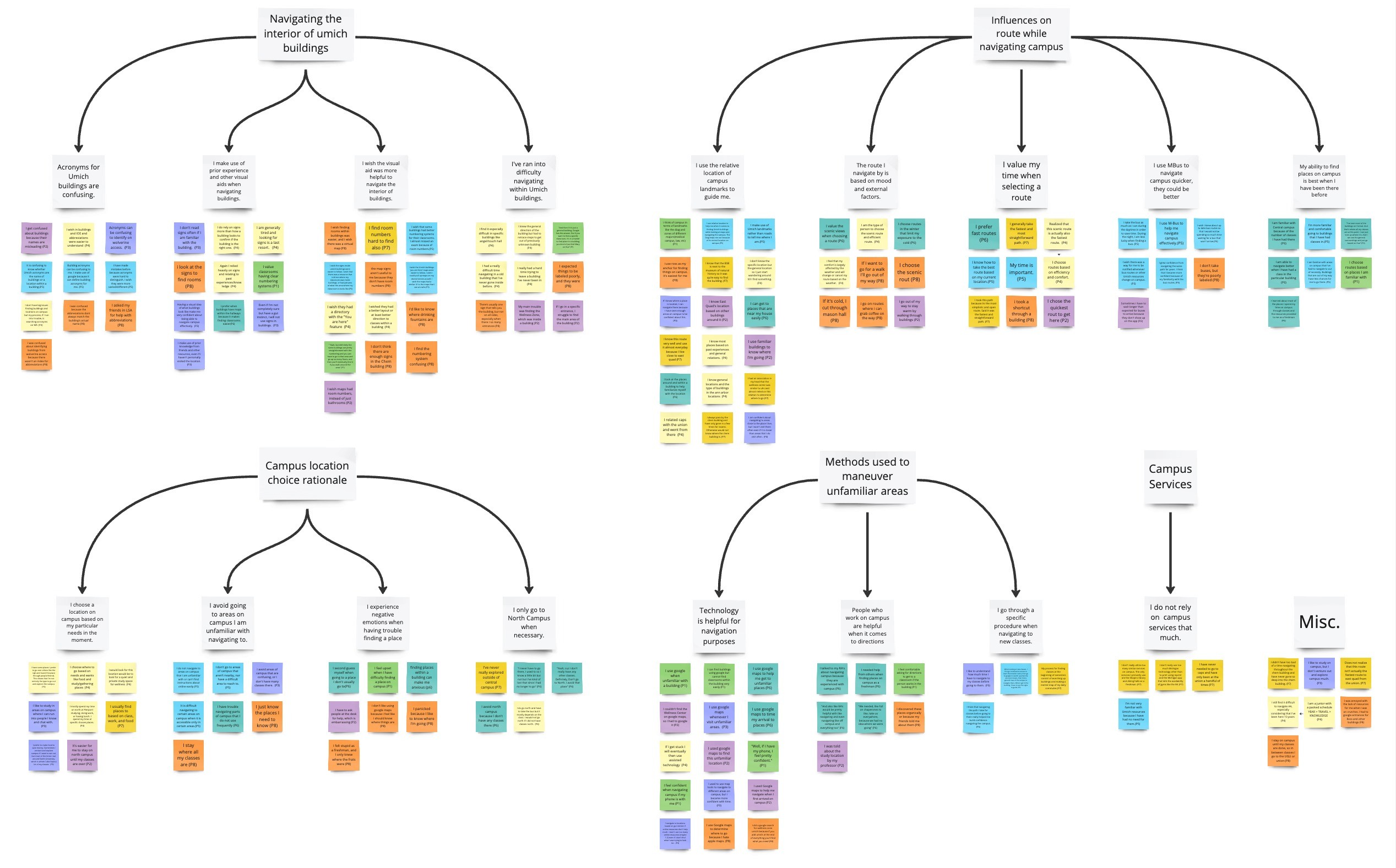
To organize our interviews into a more digestible format, I coded the interviews I took notes for, converting all relevant findings into “I” statements summarizing the participant experiences.
Affinity diagram
In total, we ran 8 contextual inquiry interviews. We added all the “I” statements into a Miro board and created an affinity diagram based on our findings by critiquing insights and establishing subcategories, then overarching themes. We found that general statements/experiences could be narrowed down to 17 types of responses and of these types they fall under 5 main themes:
Survey design
A large priority, aside from the survey questions, were mitigating collecting biased attitudinal data. So, we broke down broader questions into more objective parts to avoid leading participants to particular responses. This allowed participants to better rank/rate choices thus quantifying opinions without introducing bias.
We also were strategic about question order, placing the easier evaluative questions in the front to ease participants and build confidence, leaving the more complex and generative questions for after the respondents have warmed up.
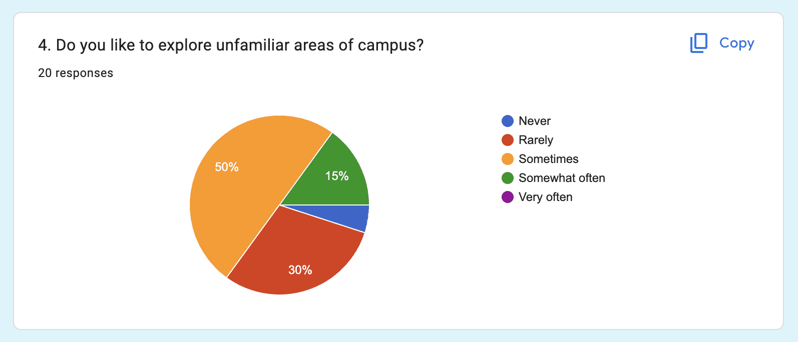
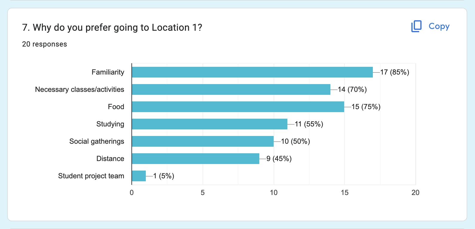
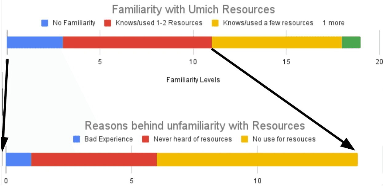
In total we received 20 survey responses:
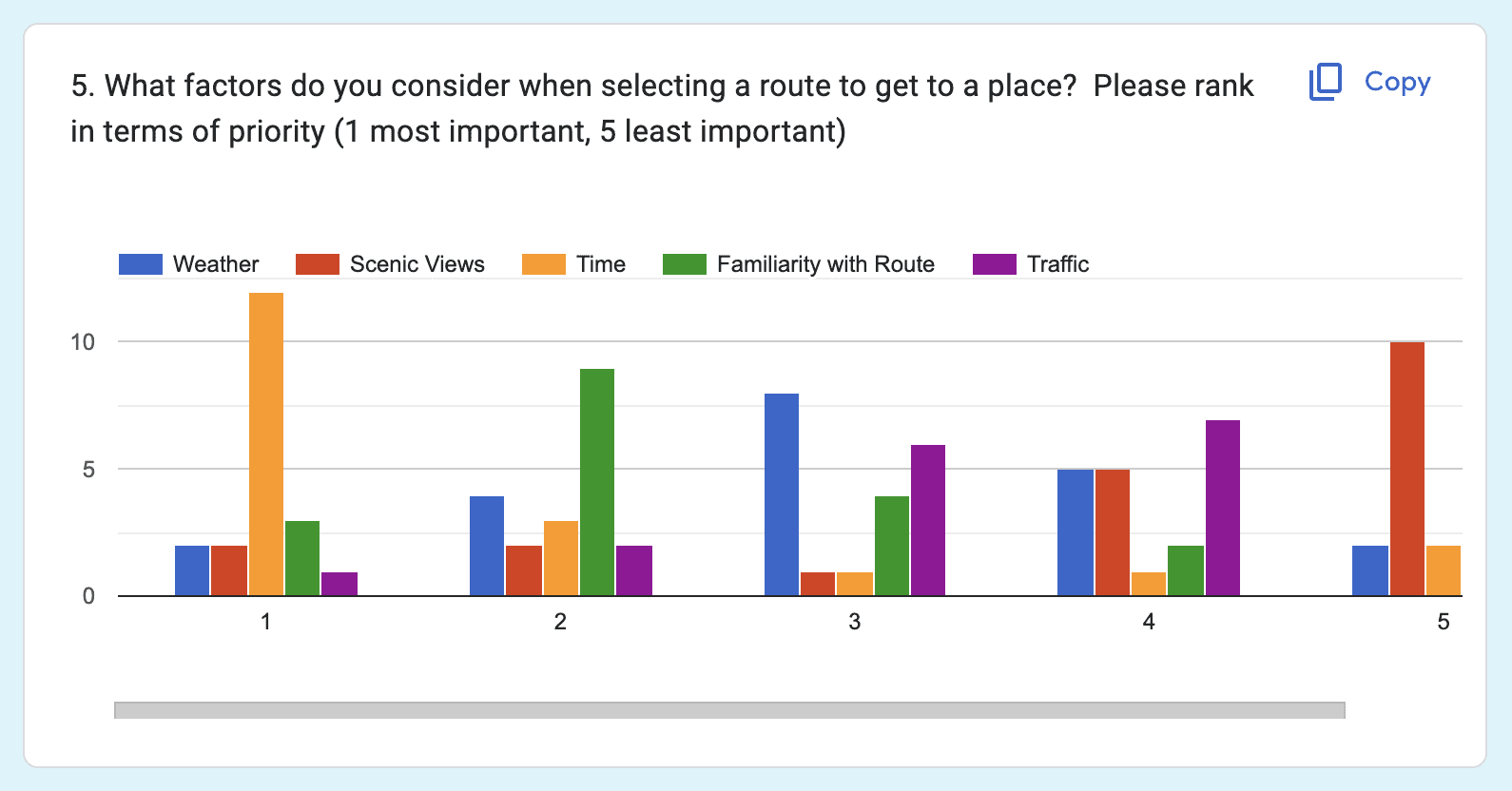
data visualization
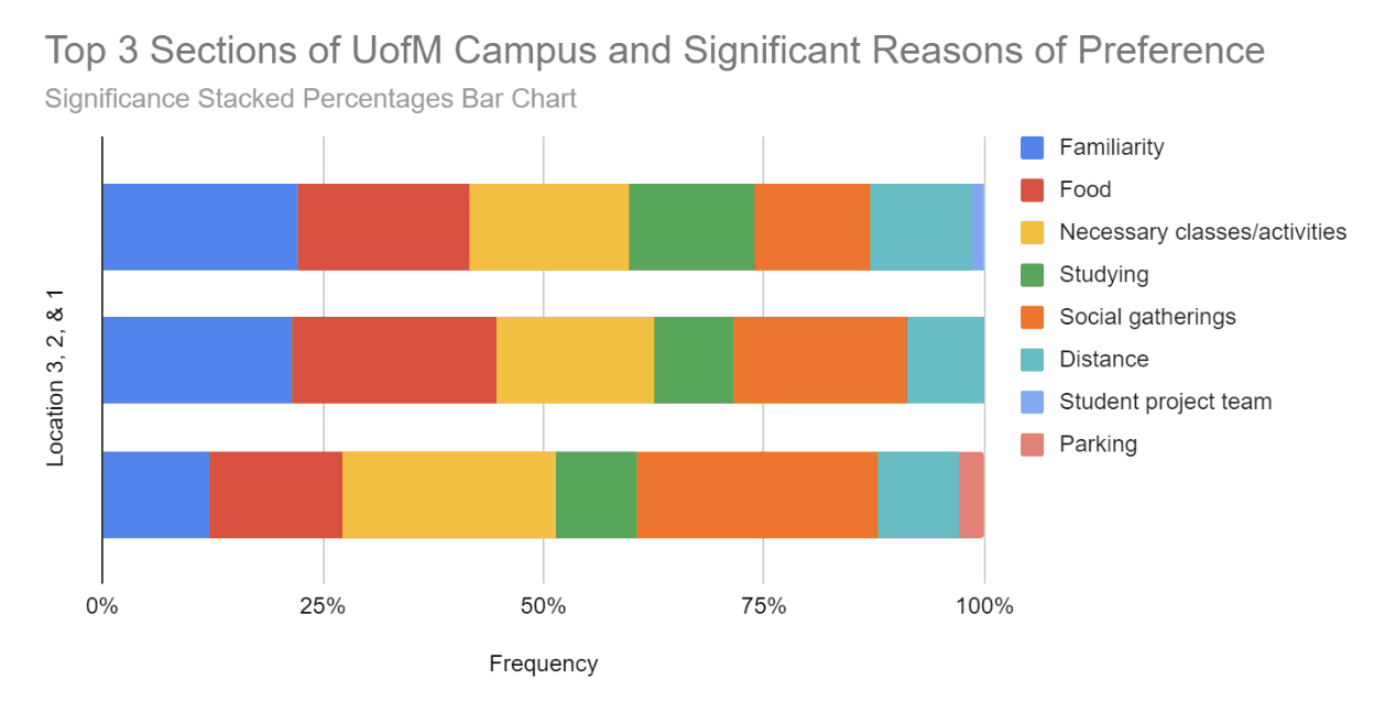
To better understand the data we gathered, each member created a graph that serves as a visualization combining the results of a qualitative metric question and a quantitative metric question.
The biggest deviant that I found was how people conceptualized their top 3 sections on campus as shown in the significance stacked percentages bar chart. This not only demonstrates how UofM students’ preferences change per ranking, but also the shared priorities when choosing their preferred locations.
KEY Takeaways
85%
of students prefer certain locations because of familiarity
75%
of students commonly rely on assistive technology to navigate the campus
Familiarity
is the number 1 reason why students would choose a location over another
80%
of students believe that existing navigating campus services could be more helpful
80%
of students use the university bus system out of necessity.
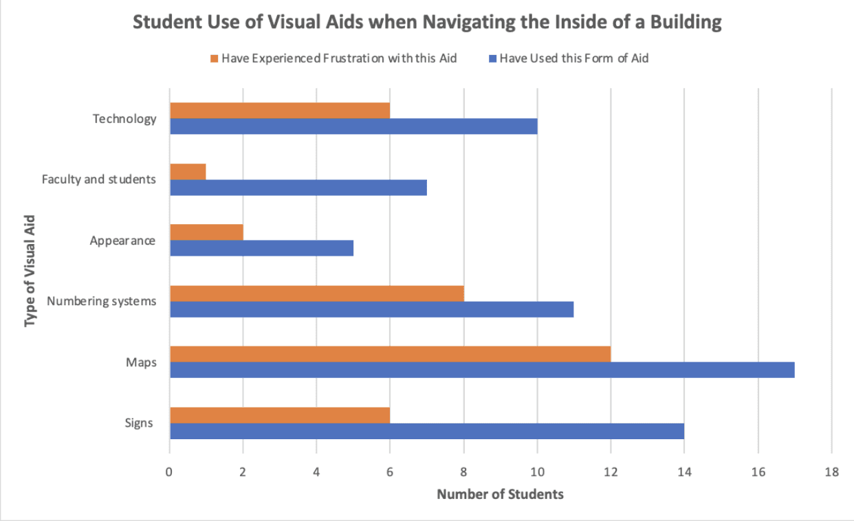
51.86%
of students experience frustrations with existing services when navigating inside buildings
Research Deliverables
To better understand the data we gathered, each member created a graph that serves as a visualization combining the results of a qualitative metric question and a quantitative metric question.
The biggest deviant that I found was how people conceptualized their top 3 sections on campus as shown in the significance stacked percentages bar chart. This not only demonstrates how UofM students’ preferences change per ranking, but also the shared priorities when choosing their preferred locations.
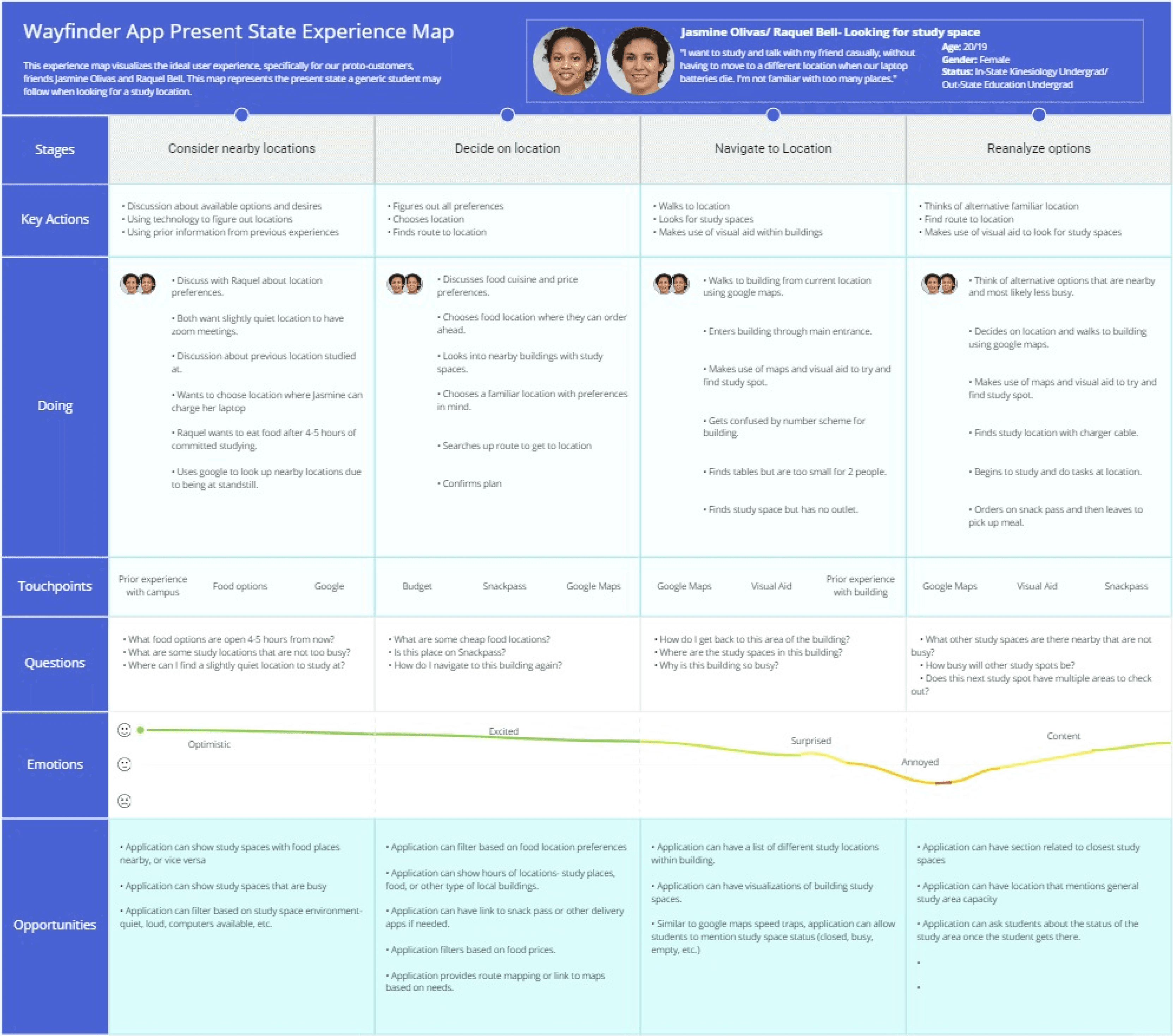
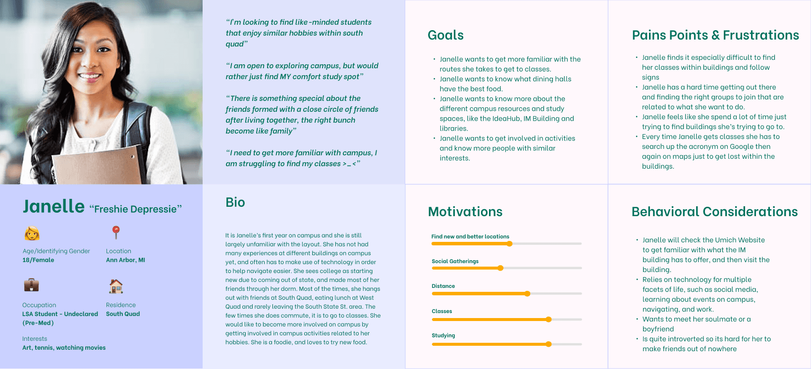
The experience map realistically represents our touchpoints, emotions, opportunities and questions students encounter when navigating campus locations, from initial consideration through arrival. Current state deliverables properly justify our research aims to identify key way-finding challenges by conveying the practical frustrations students face now, before we can address them to ease navigation in the future.
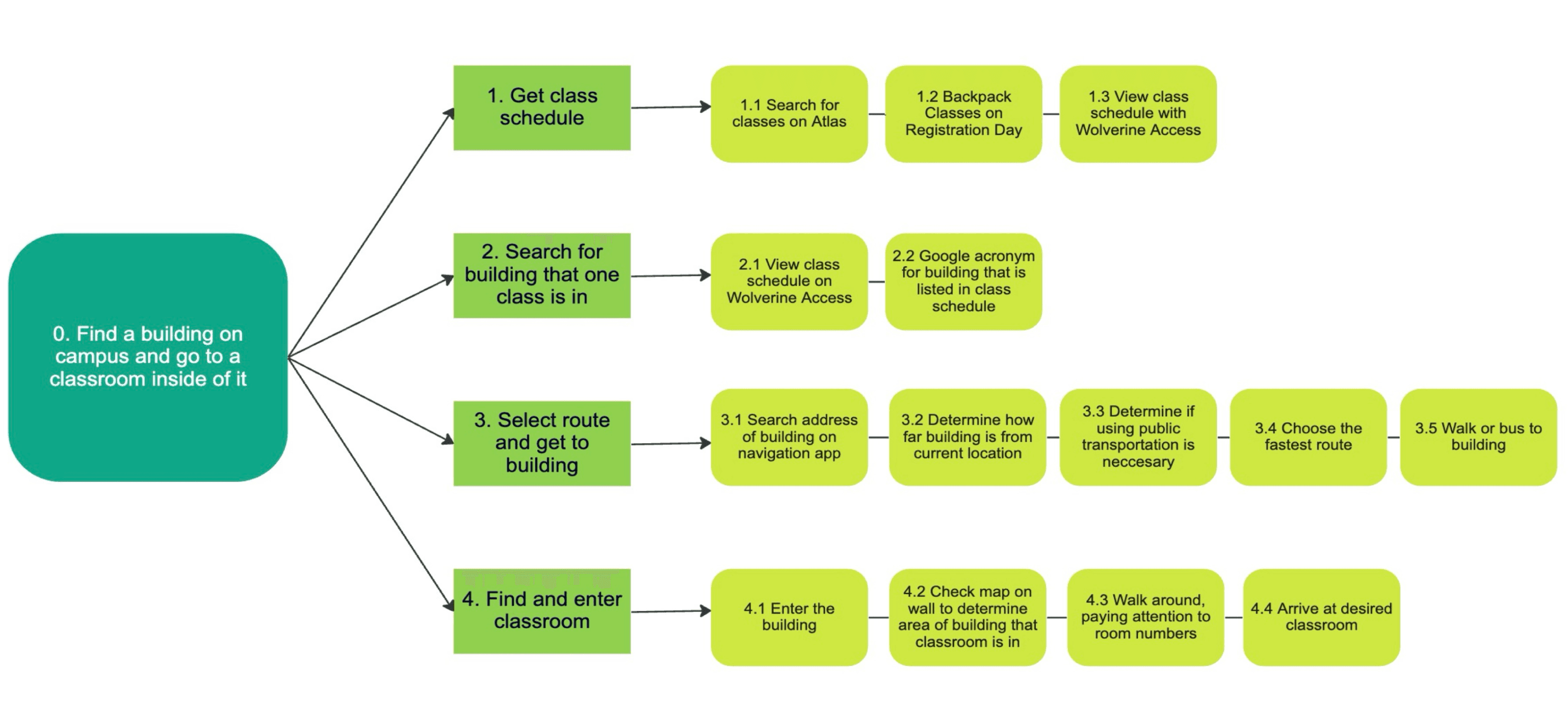
The task analysis diagram outlines the process for students to locate and navigate to a classroom, focusing on common, realistic problems faced by many students. It captures the key sequential tasks in the journey, from determining transportation needs and the building location to accessing the specific classroom, seeking to model the core experience of reaching an intended destination efficiently.
Next Steps
These research tools help us prioritize features, understand the complete user journey, and simplify key workflows in our prototype design.
By leading head first with this design we can holistically design and structure the interfaces around the users' most important tasks and start addressing most significant pain points first. Knowing the complete user journey to design for, we can start testing real users and continuously refine based on feedback.